We Hear You
Mental health platform

A mental health platform that connects users with trained listeners and improves emotional well-being. 86% of users felt better after their first chat, with an average 3-minute connection time.
The Problem
The old interface worked, but it didn’t connect.
It helped users talk, but not feel heard and that emotional gap was what I set out to close through design.
The Challenge
Redesign an existing mental health platform to make it more intuitive, empathetic, and emotionally supportive so users feel safe opening up and stay engaged longer.
What
How
Why
Results & Impact
It showed measurable improvement in emotional connection and engagement after launch.
86%
Users
Satisfaction
3min
Average
Connection Time
4.5
User Feedback
Rating
Pain Points in Old Design
The app struggled to create emotional comfort and usability balance,
making it hard for users to feel supported or connected.
01
The interface was cluttered and hard to navigate, making it difficult for users to find support quickly.
03
The app lacked the sensitivity and empathy needed for conversations about personal well-being.
02
The interface didn’t establish an emotional connection with users, which is crucial for a mental health platform.
04
Users often dropped off after a few sessions due to low engagement and limited emotional resonance.
Old Designs

The Opportunities
Users should feel emotionally supported in every interaction.
😊
Make it feel safe to open up
The old app felt distant and mechanical. The experience needed warmth, softness, and emotional reassurance.
🌱
Encourage small daily progress
Users often stopped using the app after a few sessions. I wanted to help them return gently, without pressure.
😌
Keep things light and simple
In moments of stress, people don’t want to think too hard. The flow had to be easy, clear, and supportive.
🫶
Design to feel human
Subtle animations, kind tone, and small gestures make users feel like someone is listening, not an app responding.
The Solution
I redesigned it to feel warm, supportive, and human. More like talking to a caring friend than using an app. The goal was to create a calm, safe space where talking about something feels natural and emotionally comforting.
New Designs

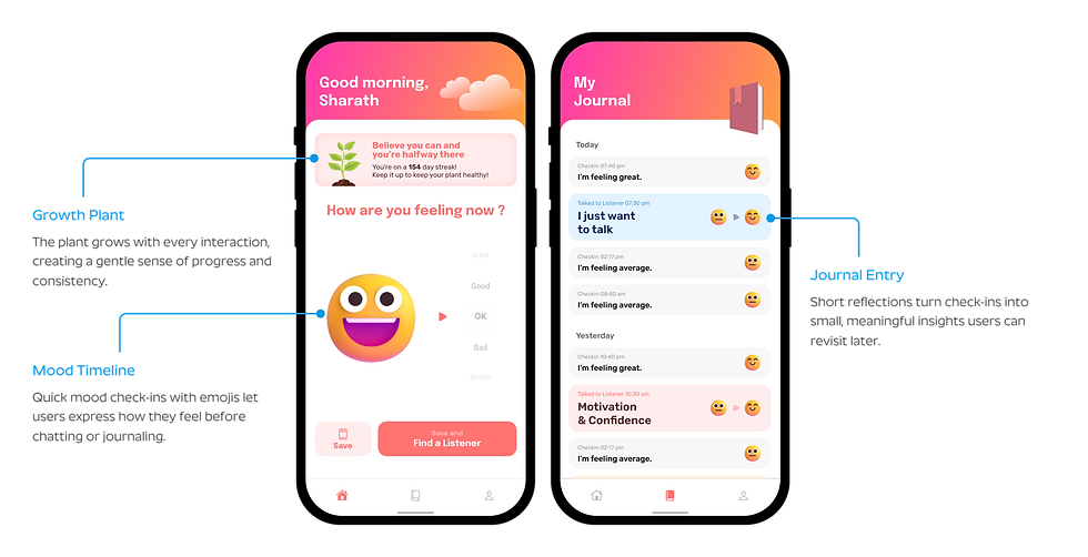
Journal Your Feelings
Journaling helps users express their emotions through simple emoji check-ins and short reflections.

Connect with a Listener
Users can choose a topic that matches their concern and get paired with a trained listener in minutes.
This makes emotional support feel personal, relevant, and quick to access.

Habit-Forming Progress & Profile
A virtual plant grows as users engage with the app daily, symbolizing their emotional progress.
Naming the plant creates a small personal bond that encourages gentle, consistent use.
Key Takeaways &
Learnings
-
I learned that emotional design drives trust as much as usability.
-
I realized how tone, color, and small interactions shape comfort.
-
I saw that habit-forming features can nurture consistency without pressure.
-
I understood that for mental health, empathy is a design principle, not a style.
-
If given more time, I’d explore how tone and motion could adapt to users’ emotional states in real time.

